The preflight report came back at 4pm on a deadline: "image resolution too low, 72 DPI." The image looks perfectly sharp on your monitor, and somebody is about to suggest you "just change it to 300 in Photoshop." That will not help, and understanding why settles this argument permanently.
Three words that are not synonyms
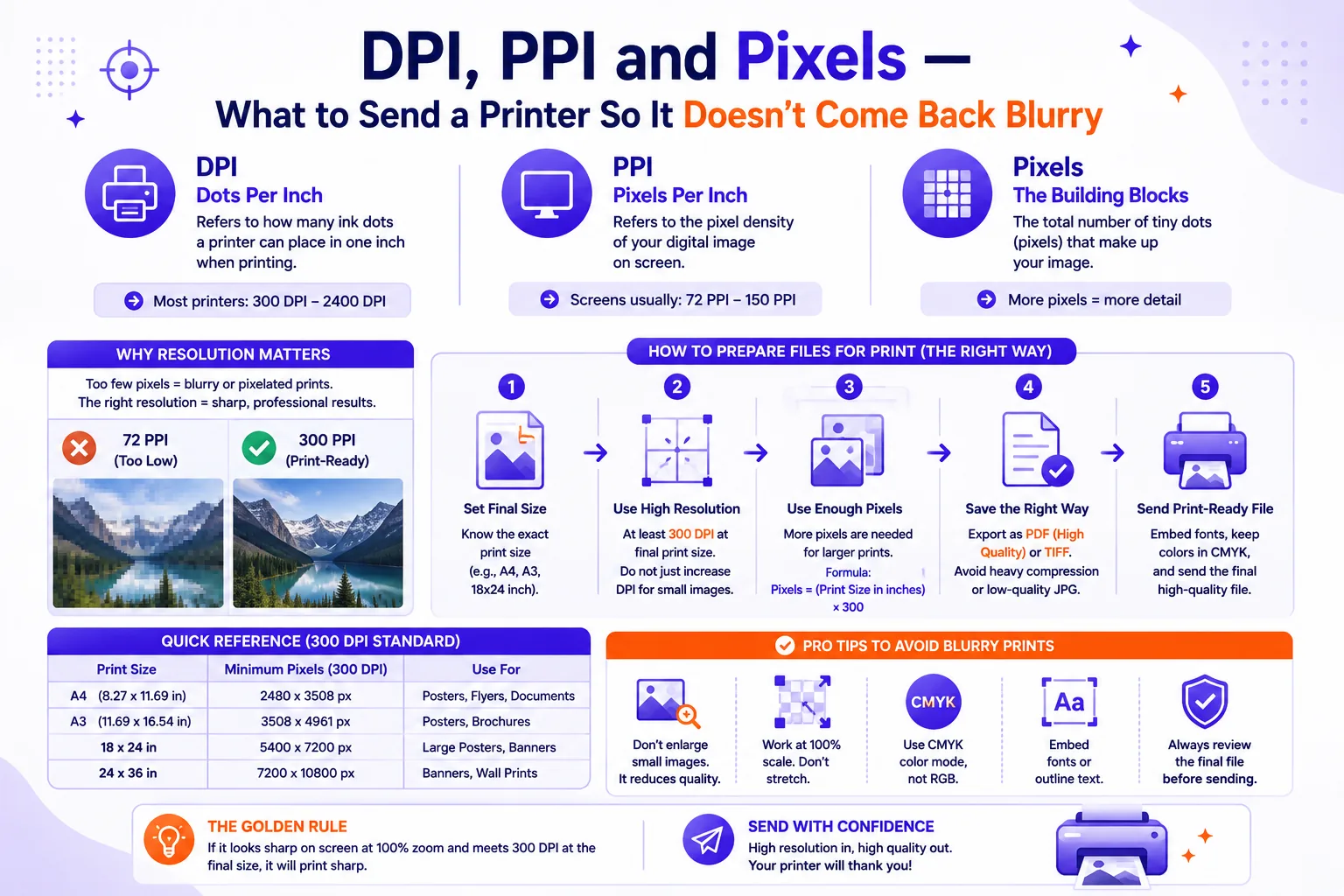
Pixels are the only quantity your image file actually stores. A photo is a grid, 4032 columns by 3024 rows, say. That grid is the entire truth of the file; everything else is a label.
PPI (pixels per inch) is a number written into the file's metadata. It carries no image data. It says "when something prints me, make me this big," and until a printing device reads it, it does nothing at all.
DPI (dots per inch) is a property of the machine. Adobe draws the line cleanly: digital images are measured in pixels per inch, while "for printing, resolution is measured by the number of dots printed in a linear inch" (Adobe). A printer does not lay down one dot per pixel. An inkjet at 1440 dpi reproducing an image placed at 300 ppi spends 1440 ÷ 300 = 4.8 dots per pixel per axis, roughly 23 ink dots per image pixel. That is how it fakes continuous tone from four fixed inks. DPI is the printer's business, not yours.
The PPI field is four bytes
People don't believe this, so I measured it: one 1200 × 1800 pixel image saved twice, once tagged 72 PPI and once 300 PPI, as both TIFF and JPEG.
| Tagged 72 PPI | Tagged 300 PPI | |
|---|---|---|
| Uncompressed TIFF | 6,480,192 bytes | 6,480,192 bytes |
| JPEG (quality 90) | 1,062,696 bytes | 1,062,696 bytes |
| SHA-256 of pixel data | 43dbdb9078d46f57… |
43dbdb9078d46f57… |
Identical file sizes, identical pixel hashes. A byte-level diff of the two JPEGs found exactly four differing bytes, at offsets 14–17, the density fields in the JFIF header. The TIFFs also differed at four bytes, in the XResolution and YResolution tags.
Changing the PPI field without resampling changes nothing about your image, you have edited a caption. Retyping 300 into the resolution box fixes the complaint without fixing the problem: preflight passes, the print still comes back soft.
What does change the file is resampling: throwing pixels away or inventing new ones. In Photoshop that is the "Resample" checkbox in Image → Image Size. Untick it and you are relabelling; tick it and you are rewriting.
The only arithmetic you need
Required pixels = physical size in inches × target PPI.
Work in inches and multiply. For metric sizes, divide millimetres by 25.4 first. Using the ISO 216 trimmed sizes, A4 is 210 × 297 mm, A1 is 594 × 841 mm (ISO 216:2007):
| Piece | Finished size | Sensible PPI | Pixels needed |
|---|---|---|---|
| Business card | 3.5 × 2 in | 300 | 1050 × 600 |
| A4 flyer | 210 × 297 mm | 300 | 2480 × 3508 |
| 8×10 photo print | 8 × 10 in | 300 | 2400 × 3000 |
| A1 poster | 594 × 841 mm | 150 | 3508 × 4967 |
| Roll-up banner | 850 × 2000 mm | 100 | 3346 × 7874 |
| Billboard (48-sheet) | 6096 × 3048 mm | 20 | 4800 × 2400 |
Vistaprint publishes exactly 1050 × 600 pixels for a standard card (their spec), same arithmetic, same answer. The billboard row is the surprise: a 20-foot billboard needs fewer pixels than an A1 poster.
300 PPI is a convention, not a law
300 PPI became the default because it sits beyond what a person can resolve at reading distance. It is right for anything someone holds and wasteful for anything on a wall. Viewing distance is the actual variable. Vistaprint's poster guidance scales it: 300 DPI for 1–3 ft viewing, 240 DPI for typical indoor, 150–200 DPI at 6–10 ft, 100–150 DPI for outdoor drive-by (Vistaprint poster guide). Large-format specialists go further, 50–75 DPI for banners and wall murals at 10–25 ft, 15–25 DPI for billboards at 50+ ft, because at that range "the human eye can't distinguish fine details" (Forest Printing).
This is why a roll-up banner at 100 PPI looks flawless from three metres. Sending a 300 PPI file for one produces a 30-megapixel monster the printer's RIP will downsample anyway.
Ask your printer what PPI they want at final size, then hit that number exactly. To resample to a specific pixel dimension, a browser-based image resizer does it without an upload, handy when the file is client product photography you would rather not put on someone else's server.
Bleed, safe margins and crop marks
If artwork runs to the edge of the finished piece it must extend past the trim line, because guillotines drift a millimetre or two. That overhang is bleed.
The common figure is 3 mm or 0.125 in, note those are not equal (0.125 in is 3.175 mm), so use your printer's stated number rather than converting. Vistaprint asks for 0.125 in of bleed on posters, with text, logos and QR codes at least 0.25 in inside the trim. Their business card spec is tighter: a 3.5 × 2 in card is supplied at 3.61 × 2.11 in with bleed (0.055 in per edge), safe area 3.36 × 1.86 in. At 300 PPI that full-bleed file is 1083 × 633 pixels, again, physical size × PPI.
Crop marks are the corner lines showing the guillotine where to cut. They sit outside the bleed area, and print-ready PDF presets add them automatically, in InDesign, the Marks and Bleeds panel of the Export dialog. Never draw them by hand.
Why your blues come back wrong
Screens make colour by adding light (RGB). Presses subtract it with four inks (CMYK), and the set of colours four inks can hit is smaller. Vistaprint lists "shifting on-screen RGB colours or colours looking dull in print" as a standard failure with a standard fix: convert to CMYK before you send.
I ran real sRGB values through FOGRA39L Coated, the standard European coated-stock CMYK profile, and back, to see what survives:
| Colour | sRGB in | CMYK % | RGB back out |
|---|---|---|---|
Pure blue #0000FF |
0, 0, 255 | 95/88/0/0 | 57, 64, 143 |
Pure green #00FF00 |
0, 255, 0 | 66/0/99/0 | 102, 179, 58 |
Brand navy #1B3A6B |
27, 58, 107 | 98/72/0/47 | 29, 59, 107 |
Mid grey #808080 |
128, 128, 128 | 51/42/42/18 | 128, 128, 128 |
The saturated blue and green collapse, that electric blue prints as a dusty indigo, and no press setting rescues it. The navy and grey return unchanged. The rule: the brighter and more saturated the blue or green, the further it moves. Convert deliberately in your own software so you choose the compromise, rather than letting the printer's RIP choose it for you at midnight.
Black is two different colours
100% K alone prints as a washed dark grey over large areas, it is one thin layer of ink. Rich black adds the other three underneath. One commercial printer specifies rich black as C60 M40 Y40 K100 and reserves plain 100% K for "all text, barcodes, and fine details," noting a total ink limit of 240% (Sttark), and 60+40+40+100 is exactly 240.
Use rich black for large blocks and backgrounds, plain K for body text and fine detail: four plates that misregister by a hair turn small type into a coloured blur.
When someone hands you a 600px logo for a banner
Be straight about the arithmetic. A 600-pixel-wide logo stretched across an 850 mm roll-up banner is 600 ÷ 33.46 = 17.9 PPI. On a 594 mm-wide A1 poster it is 25.6 PPI. Both are below even billboard tolerances, and a banner is viewed from two metres, not fifty.
The honest options, in order:
- Get the vector. Ask for the
.ai,.eps,.svgor layered source. Someone made this logo in vector originally; it exists somewhere. - Revector it. If the source is gone, have it redrawn as paths. For flat line art, type and geometric marks this takes an experienced person under an hour and is resolution-independent forever.
- Redesign around it. Shrink the logo to a size 600 pixels can carry and let type or photography hold the space.
- Reshoot or rescan if it is a photograph rather than line art. A 1200 dpi scan of a printed original beats any upscale.
Upscaling is not on that list for line art. Upscalers guess at edges, and on a logo a guessed edge is a wrong edge, wobbling curves, softened corners, a wordmark that is subtly not the wordmark. On a photograph viewed at distance a modest upscale is survivable; on a logo it is not.
Pre-flight checklist
- Pixel dimensions ≥ finished inches × the PPI your printer asked for
- Resampled, not relabelled, confirm the pixel count actually changed
- Bleed at your printer's stated measurement, not a converted approximation
- Text and logos inside the safe margin; crop marks from the export preset
- Converted to CMYK, saturated blues and greens checked by eye afterwards
- Rich black for large areas, 100% K for text
- Fonts embedded or outlined