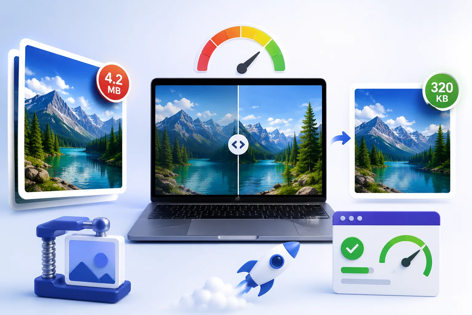
Your PageSpeed report puts Largest Contentful Paint at 4.1 seconds and blames the hero photo: a 3.2 MB JPEG straight off a camera, rendered into a slot 800 pixels wide. The rest of the page is lean. That one file is the page.
Most advice here stops at "run it through a compression tool." That skips the part that matters: the order of operations decides how much you save, and the biggest win is not the compression setting at all.
Start with the metric you are actually fixing
Largest Contentful Paint measures when the largest visible element in the viewport finishes rendering, timed from when the user first navigated to the page. Google's thresholds are 2.5 seconds or less for "good", 2.5 to 4.0 seconds for "needs improvement", and above 4.0 seconds for "poor", assessed at the 75th percentile of page loads across mobile and desktop. Not your best load, and not your average: a quarter of your visitors can be slower than your score.
Eligible elements are <img>, <image> inside <svg>, <video>, elements with a CSS background-image: url(), and block-level elements containing text. In practice it is nearly always an image. The 2025 Web Almanac found the LCP element was an image on 76.0% of mobile pages and 85.3% of desktop pages. So "make the page faster" usually collapses into "make one specific image arrive sooner."
1. Serve the right dimensions
This is almost always the largest single saving, and it is pure arithmetic.
A 4000 × 3000 photograph is 12,000,000 pixels. Displayed in an 800 × 600 slot, the browser paints 480,000 pixels.
480,000 ÷ 12,000,000 = 0.04
Four percent. The browser downloads, decodes and holds all 12 million pixels, then throws 96% of them away at paint time. No quality slider recovers bytes you never needed to send. Google's guidance is blunt: desktop-sized images on mobile can use two to four times more data than needed.
I measured how bytes track dimensions. In a sandbox with Python and Pillow, I took a real 512 × 512 photograph, downscaled it with Lanczos resampling, and encoded each version as progressive JPEG at quality 80. These are measured numbers, not estimates:
| Width | Pixels | Size | vs. full size | Bytes per megapixel |
|---|---|---|---|---|
| 512 px | 262,144 | 43.3 KB | 100% | 169,090 |
| 384 px | 147,456 | 27.8 KB | 64% | 193,353 |
| 320 px | 102,400 | 21.1 KB | 49% | 211,494 |
| 256 px | 65,536 | 15.2 KB | 35% | 236,954 |
| 128 px | 16,384 | 5.6 KB | 13% | 350,281 |
Note the last column. Bytes do not fall in proportion to pixel count, halving the width quarters the pixels but only reaches 35% of the bytes, because detail packs more densely into each surviving pixel. The saving is still enormous, just not linear.
Rule: resize to the display slot, double it for high-density screens, stop there. An 800 px slot wants a 1,600 px file, not a 4,000 px one.
2. Pick the format
Once the pixel count is right, the encoder decides the rest. I encoded the same photograph in three formats, using SSIM (structural similarity against the original, where 1.0 is identical) to compare like with like, quality numbers mean different things in different codecs.
| Format | Quality | Size | SSIM | vs. JPEG |
|---|---|---|---|---|
| JPEG | 80 | 43.3 KB | 0.9458 | , |
| WebP | 80 | 29.3 KB | 0.9460 | 32% smaller |
| AVIF | 60 | 21.6 KB | 0.9476 | 50% smaller |
At effectively identical measured quality, AVIF was half the size of JPEG and WebP about a third smaller. Support is no longer the obstacle: caniuse puts WebP at 96.18% global support and AVIF at 94.67%, with AVIF in Chrome 85+, Firefox 93+ and Safari 16.4+.
Use AVIF with a fallback, and let the browser choose:
<picture>
 <source srcset="hero.avif" type="image/avif">
 <source srcset="hero.webp" type="image/webp">
 <img src="hero.jpg" alt="…" width="1600" height="1200">
</picture>
Keep PNG for screenshots, logos and hard-edged graphics, where lossy artefacts show.
3. Quality settings that are genuinely invisible
Here is the sweep I measured on the same photograph, encoding progressive JPEG at descending quality:
| Quality | Size | SSIM | Size vs. q95 |
|---|---|---|---|
| 100 | 182.5 KB | 0.9845 | , |
| 95 | 88.1 KB | 0.9700 | 100% |
| 90 | 62.2 KB | 0.9603 | 71% |
| 85 | 50.3 KB | 0.9522 | 57% |
| 80 | 43.3 KB | 0.9458 | 49% |
| 75 | 38.2 KB | 0.9405 | 43% |
| 60 | 30.0 KB | 0.9274 | 34% |
Two things fall out of that. Quality 100 costs more than double quality 95 for a similarity gain of 0.0145, nobody sees that on a phone. And quality 80 is 49% the size of quality 95: the file halves while SSIM moves from 0.9700 to 0.9458, a difference that does not survive being viewed at normal size.
Below about 75 the curve flattens, you keep losing quality but stop saving much. q75 to q85 is the working range for photographs: the top for heroes someone might inspect closely, the bottom for thumbnails.
If you want to check a specific image rather than trust a general rule, Qikks Tools' image compressor runs the encode in your browser so you can compare output against the original before committing.
4. Give phones their own files with srcset and sizes
Resizing to a single size still sends a desktop file to a 390 px phone. srcset offers several widths; sizes tells the browser how wide the slot will be so it can choose before layout.
<img src="hero-800.jpg"
 srcset="hero-400.jpg 400w,
 hero-800.jpg 800w,
 hero-1600.jpg 1600w"
 sizes="(max-width: 600px) 100vw, 800px"
 width="1600" height="1200" alt="…">
Three to five widths is the normal spread. sizes accepts px, vw, em and calc(), but not percentages; 25% is invalid. Get it wrong and you lose the benefit: the 2024 Web Almanac found one in five sizes attributes inaccurate enough to make browsers pick a suboptimal file, with a quarter of desktop pages using width descriptors loading 180 KB or more of wasted image data.
5. Lazy-load below the fold, never the LCP image
Add loading="lazy" to images below the fold and the browser defers them until they approach the viewport. On a long product listing that is most of the page weight.
Not the hero. web.dev is unambiguous: "Never lazy-load your LCP image, as that will always lead to unnecessary resource load delay." Lazy loading forces the browser to wait for layout before it even requests the file, precisely the delay you are trying to remove. This is a common, real mistake: the Almanac found roughly 16–17% of pages lazy-loading their own LCP image.
6. Mark the hero as high priority
The browser assigns priorities before layout, and does not always guess right. Tell it:
<img src="hero-1600.avif" fetchpriority="high" alt="…">
Use it on the one image you believe is the LCP element. web.dev warns that "setting a high priority on more than one or two images makes priority setting unhelpful." Only about 17.3% of mobile pages use it at all, cheap ground.
7. Always set width and height
Every <img> needs explicit width and height. Browsers derive an aspect ratio from them and reserve the space before the file arrives, stopping content jumping as images load, what Cumulative Layout Shift measures, where "good" is 0.1 or less at the 75th percentile. MDN notes this matters most for lazy-loaded images, which have zero height until loaded and can otherwise never trigger their own load. With srcset, keep every width at the same aspect ratio so one pair of attributes stays correct.
A realistic byte budget
Take a product page with one hero and eight thumbnails, all straight from a camera at quality 95, and apply the bytes-per-megapixel rates I measured above, roughly 165 KB/Mpx for JPEG q80 and 82 KB/Mpx for AVIF q60:
| Before | After | |
|---|---|---|
| Hero | 4000×3000 JPEG q95, 3.2 MB | 1600×1200 AVIF q60 ≈ 160 KB |
| 8 thumbnails | 8 × ~380 KB = 3.0 MB | 8 × ~20 KB = 160 KB |
| Total | ≈ 6.2 MB | ≈ 320 KB |
Roughly a 95% cut, and the dimension change did most of it before the encoder was involved.
Checklist
- Find the LCP element in PageSpeed Insights. It is probably an image.
- Resize to the display slot × 2. Never ship 4000 px into an 800 px box.
- Encode AVIF with WebP and JPEG fallbacks in a
<picture>element. - Quality 75–85 for photographs. Never 100.
- Add
srcsetwith 3–5 widths and asizesvalue that matches your CSS. loading="lazy"below the fold only.fetchpriority="high"on the hero, and nothing else.widthandheighton every single image.
Points 2 to 4 are the batch job. The web-ready images workflow chains resize, convert and compress in one pass, so a folder of camera originals comes out sized and encoded, leaving only the markup to do by hand.