You spent an afternoon on a product shot, posted it, and three weeks later it appears on someone else's storefront with your name nowhere near it. So you start watermarking, and the next problem shows up immediately: the mark either sits in a corner where a five-second crop deletes it, or it is stamped across the middle so heavily that nobody wants to look at the photo any more.
Both failures come from the same mistake, treating a watermark as security. It isn't. Once you accept what it actually does, the design decisions get much easier.
Start from the honest goal
A visible watermark does two things well. It attributes the image, so anyone who sees it downstream knows who made it and where to find you. And it deters casual reuse, because a stranger looking for a free hero image will usually scroll past a marked photo rather than deal with it.
It does not stop a determined person. Content-aware fill and generative removal handle simple marks in seconds, and no amount of opacity tuning changes that. If your mental model is "this prevents theft", you will keep escalating the mark until the photo is worthless, which is the real, self-inflicted damage most watermarking causes.
Design for the honest goal instead: survive the cheap attacks, stay readable, stay out of the way.
Placement that survives a crop
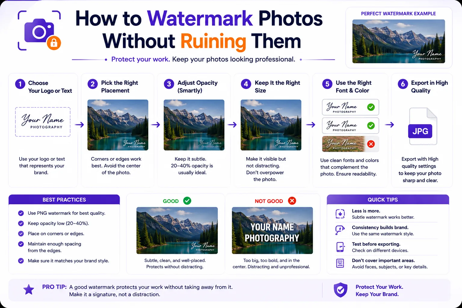
A logo in the bottom-right corner is the easiest thing in the world to remove. Drag a crop handle in and the composition usually still works, because photographers habitually leave breathing room at the edges. Corner marks are attribution for honest reposters, nothing more.
To make cropping expensive, put the mark somewhere the crop would cost the viewer something:
- Move it inward. Sit the mark roughly 8–15% in from the edge rather than 2%. Cropping now eats into real subject matter.
- Overlap the subject, not the background. A mark laid across the lower edge of the product, the model's shoulder, or the building facade cannot be cropped away without cropping the thing people came for.
- Avoid dead uniform areas. Flat sky, seamless white backdrop and blurred bokeh are exactly where removal tools do their best work. Put the mark over texture and detail.
- Vary the position across a set. If every photo in your shop is marked bottom-right, someone can batch-crop all of them in one action.
The trade-off is real: an inward mark is more intrusive. That is the point, and it is why the next two decisions matter.
Opacity and size that stay legible
The usable range is narrower than people expect.
| Setting | Sensible range | Notes |
|---|---|---|
| Opacity | 25–45% | Below ~20% it vanishes on busy images; above ~55% it starts competing with the subject |
| Mark height | 3–6% of image height | Enough to read at thumbnail size, small enough to ignore |
| Mark width | Under ~25% of image width | Wider than a quarter of the frame reads as a banner, not a signature |
| Inset from edge | 8–15% of the shorter side | Deep enough that cropping hurts |
Check legibility at the size people will actually see. If the text is unreadable in a 400px-wide feed preview, the watermark is doing nothing except degrading the photo.
Text, logo or signature
| Type | Best for | Watch out for |
|---|---|---|
| Plain text (name, handle, domain) | Anyone who wants the mark to be actionable, a searchable handle or URL | Long strings force a small type size; keep it under ~20 characters |
| Logo (PNG with transparency) | Brands with an existing mark and consistent placement rules | Detailed logos turn to mush below ~40px; use a simplified one-colour version |
| Scanned signature | Fine-art and portrait work where the mark is part of the presentation | Hardest of the three to read at small sizes, and easiest to fake |
For most sellers and photographers, a domain or handle in a plain, wide sans-serif beats a logo: it survives scaling and tells the viewer where to go next.
One mark or a tiled grid
A single mark is the default: portfolio images, social posts, product listings, anything that still has to look good.
Tiling is for proofs and previews only, client selects before payment, stock comps, contact sheets. It makes removal painful and the image unusable, which is the intent. Keep tiled opacity low (15–25%) and rotate the tile 30–45° so it fights the image's own lines.
Colour, stroke and shadow
The failure case is predictable: white text disappears on a bright sky, black text disappears in shadow, and a mixed set of photos means one colour will always be wrong somewhere.
Two reliable fixes. Use white fill with a thin dark stroke (1–2px at 1000px image width, scaled up proportionally) or white fill with a soft drop shadow at low opacity and a few pixels of blur, either gives the mark an edge that reads against both light and dark ground. And pick the least-saturated version of your brand colour rather than the brand colour itself: a 40%-opacity mid-grey mark disappears politely into most images, while a 40%-opacity saturated orange fights everything.
Test on your two worst cases, your brightest, flattest image and your darkest. If one setting works on both, you are done.
Scale the mark proportionally, not in pixels
This is the mistake that makes watermarks look amateurish across a catalogue. If you set a fixed 200px-wide mark, then export the same photo at several sizes, the mark's relative size changes every time.
Work out the arithmetic once. Take a mark set to 4% of image height:
| Export height | Mark height at 4% |
|---|---|
| 1080 px (social) | 43 px |
| 1600 px (web hero) | 64 px |
| 2400 px (print preview) | 96 px |
| 4000 px (full-resolution) | 160 px |
A fixed 200px mark would be 19% of the height of the 1080px export, a banner, and 5% of the 4000px one. The same number produces two completely different designs. Express size and margin as a percentage of the image, and apply the watermark after resizing, not before.
Qikks Tools' watermark tool works this way by default, and runs entirely in your browser, so the originals never leave your machine.
Applying it consistently across a batch
Write your settings down as a spec, mark file or text string, percentage height, percentage inset, anchor, opacity, rotation, stroke colour, and reuse it exactly. Then:
- Edit and colour-grade first.
- Resize to the target export dimensions.
- Apply the watermark with percentage-based settings.
- Export, then spot-check the darkest and brightest images in the batch.
Keep the unmarked masters, you will eventually need a clean version for a licensed use, a print, or a client who paid for it.
What a watermark does not protect against
It does not survive a determined crop, it does not travel with the file's ownership record, and it does not help you find infringements. Three things fill those gaps.
Embedded metadata. IPTC's Creator, Credit Line and Copyright Notice fields (mapped to XMP dc:creator, photoshop:credit and dc:rights) are read and displayed by Google Images, and a Web Statement of Rights URL triggers the "Licensable" badge, per IPTC's own guide to photo metadata on Google Images. Fill these in. Be aware they are fragile in transit: IPTC's 2019 platform test found Twitter stripped saved-file metadata entirely and Flickr replaced the embedded Creator with the account owner's name.
Metadata also has legal weight that a pixel watermark lacks. Under 17 U.S.C. § 1202, author name, copyright notice and terms of use qualify as copyright management information, and intentionally removing or altering it to conceal or facilitate infringement is prohibited in its own right.
Reverse image search. Google Lens and TinEye are how you actually find reuse. They work better on unmarked or lightly marked originals, which is another reason to keep clean masters.
Content Credentials (C2PA). Google announced in September 2024 that it surfaces C2PA data through "About this image" in Google Images and Lens. It is a provenance record, not protection, the C2PA FAQ says plainly that Content Credentials are not DRM. Manifests can be stripped by platforms that do not support the standard, which is why the Content Authenticity Initiative pairs them with invisible watermarks that can recover the manifest from a database.
Registration. In general terms, formally registering copyright with your national office is a separate step from marking the file, and in the United States it unlocks remedies otherwise unavailable; the US Copyright Office runs group registration for published photographs aimed at high-volume shooters. This is general information, not legal advice, talk to a lawyer about your own situation.
Before you export, check
- Mark sized as a percentage, not a pixel value
- Opacity between 25% and 45% for single marks
- Inset 8–15% from the edge, overlapping the subject
- Stroke or shadow so it reads on light and dark
- IPTC Creator, Credit and Copyright Notice filled in
- Unmarked master saved somewhere you will find it again
Settings locked in? Run the set through the watermark tool and keep the spec for next time.